One hundred percent of the people who describe to me what they want their small business website to do have it all wrong. In fact, they have it 180-degrees wrong. They tell me they want it to do the exact opposite of what it should actually do.
They say, “I want my small business website to be able to take orders.”
WRONG. FAIL. STOP IT.
Your small business website should not be about taking orders. It should be about giving orders.
The small business website of yesterday — sadly the one most small businesses still have — is that of a brochure. Look! We have 56 pages of boring crap telling you who we are, when we were founded, how “patented” and “innovative” our process is and who’s on our board of directors. The website does little but take up space.
Today’s small business website — the ones that actually accomplish business goals for clients — are designed to give orders. What that means is as soon as a visitor arrives, the website tells them what to do, where to go and what action to take.
This reminder came to me as I was describing a client’s website to her. I said something along the lines of:
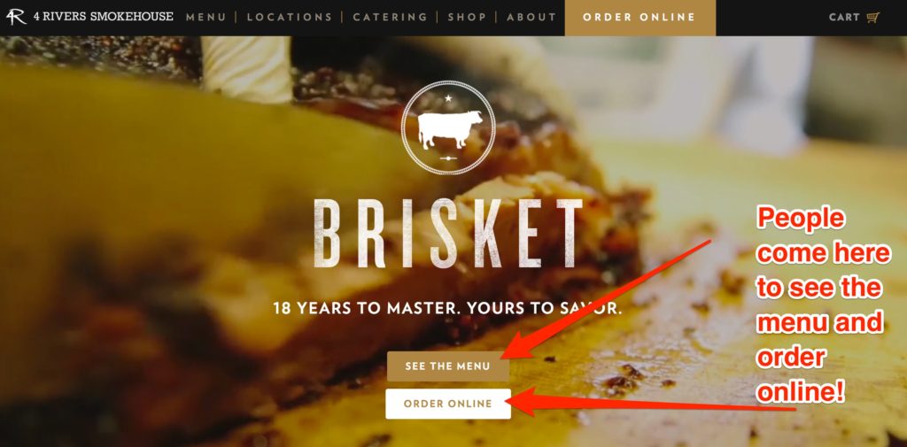
“You’ve got some pretty pictures above the fold on the front page. But that means I have to take an action just to see what the site does or has to offer. I have to scroll first. The first thing I should do is see one, two or three calls-to-action that tell me what to do. Subscribe! Purchase! Tell Us What You’re Looking For!”
A well-designed small business website is going to immediately tell the visitor where to go to get what THEY need, not what the business needs. So make sure that the top two, three or four things your typical website visitor wants are represented with calls-to-actions and links to complete them above the fold on the front page.
How do you do that? Ask yourself, “Why do people typically come to my website?” The answer is probably going to be one or more of the following:
- Find your contact information
- Learn more about your company/product/service
- Purchase or order the big thing you sell
- Ask a question
So, above the fold — and I don’t mean in the navigation bar (more in a moment — make sure you have big buttons, forms or widgets that say, “Contact Us” “Learn More” “Buy Now” or “Ask A Question.” Big, bold, simple … so people can’t miss them.
To better optimize your small business website, go to the next page they would go to then ask the question again, “Now that they’re on this page, what is the one, two or three things they want to do here?” Make sure it’s super simple for them to see how to do that. Iterate that question and answer process throughout the site and you’ve completed your first user experience (UX) project!
About the Navigation Bar
The navigation bar for your small business website doesn’t count as an above the fold call-to-action. People ignore navigation bars unless or until they can’t find what they’re looking for on the page. If they don’t see the big, flashing box that says, “Buy Now,” they go looking for it. But the point of optimizing your small business website is so they don’t have to go looking for it.
People ignore top navigation bars like they ignore banner ads.
Make it easy for people to immediately know — because they’ve been told — where to click next. Then, your website will be giving orders. And guess what? It’ll wind up taking more, too.
Know of a great website that does this? Share a link in the comments. We want to see, too!